
How to Calibrate Your Monitor for More Accurate Colors
A practical monitor calibration guide covering brightness, contrast, white point, color modes, ambient light and browser-based checks.
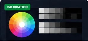
Calibration means adjusting a display so that its output is closer to a known target. Without measurement hardware, you cannot create a laboratory-grade profile, but you can still avoid several common mistakes and improve consistency.
Begin with the correct picture mode
Choose a neutral or standard mode before making adjustments. Vivid, dynamic and gaming presets often increase saturation, sharpening or contrast in ways that make visual comparisons harder.
Set brightness for the room
Brightness should be comfortable and should preserve detail rather than simply look impressive. A display that is too bright in a dim room can feel harsh; too dim in a bright room can hide shadow detail.
Check black and white separation
Use near-black and near-white patterns to make sure neighboring shades remain distinguishable. Avoid settings that crush dark detail or clip bright steps.
Use neutral grayscale as a sanity check
Gray should not obviously lean red, green or blue. Remember that room lighting affects perception, so evaluate the display under the conditions in which you normally work.
Know when you need a colorimeter
If you edit photographs, grade video, prepare print work or need repeatable color between devices, use measurement hardware and an ICC-capable workflow. Visual adjustment is useful for general viewing, not for certifying color accuracy.
For photography, print matching or professional video work, hardware colorimeters and ICC profiles provide measurements a browser cannot. For normal office, gaming and home use, however, disciplined visual checks can still expose extreme settings, crushed detail, color casts and inconsistent picture modes before you decide whether specialist calibration is necessary.
- Use grayscale and gradient patterns to look for clipped shadows, blown highlights and visible banding.
- Compare red, green and blue full-screen colors for obvious channel imbalance or unusual tint.
- Check text on white and dark backgrounds after changing display modes because sharpening can affect perceived clarity.
- Keep operating-system night-light or blue-light reduction settings consistent during comparisons.
Practical browser-based checks
Brightness mainly affects how much light the display produces, while contrast and tone controls affect the separation between dark and bright information. Color temperature changes whether white appears warmer or cooler. Adjusting one control cannot fully compensate for another. For everyday use, the goal is not maximum brightness but a comfortable level where highlights remain distinct and dark detail is not crushed.
Brightness, contrast and color are separate controls
Calibration is easier to judge when the room lighting is consistent. Very bright sunlight, colored lamps or reflections can change how neutral grays and whites appear to your eyes. Give the display time to reach its normal operating state, disable temporary eye-comfort filters while evaluating color, and begin from a known picture mode rather than a heavily customized preset.
Start with a stable viewing environment
Related tests and guides
Remember: browser diagnostics are observational tools. They can reveal repeatable visual symptoms, but they do not replace laboratory measurement or a technician when hardware diagnosis is required.